Case study: Rebuilding the Down Is Where You Land cover from reader feedback
The first coverThe new cover (now on Amazon)
The starting point
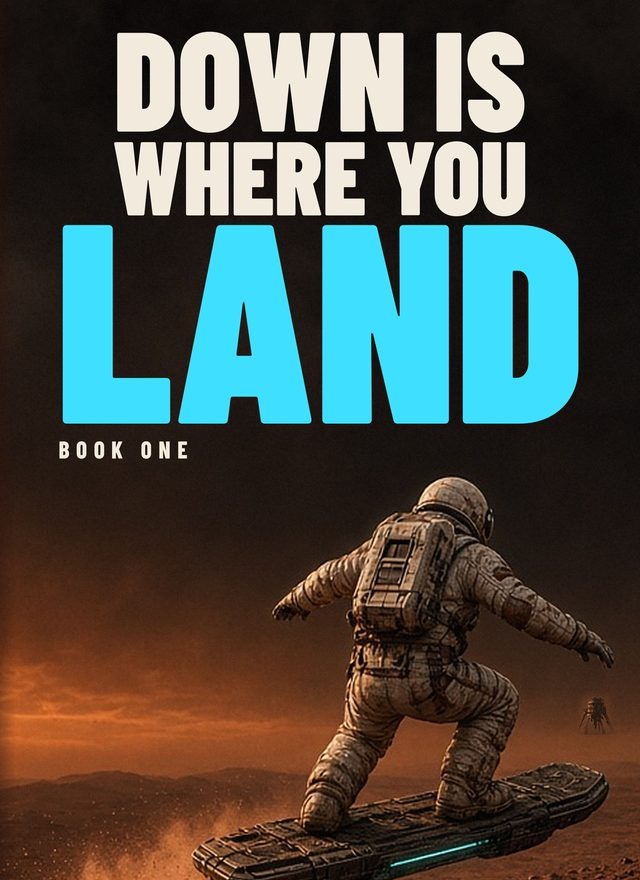
The first cover of Down Is Where You Land showed an astronaut riding a hoverboard over a dusty planet. The title was big and "LAND" was bright blue, with a small "BOOK ONE" line and the author name in a dark band at the bottom. I shared it with readers in an indie cover critique group and asked for honest feedback.
What readers liked
"Nice composition."
It's "on target for genre."
The cover design "works well" aside from the image.
What readers pushed back on
The figure got lost. One reader said "the mass of dark fiddly detail obscures the figure of the astronaut." Another asked if the figure could be "lighter against the background."
Generic and bland. One reader said it "is just bland" and "almost looks like a space skateboarding book."
BOOK ONE was hard to read small. The suggestion was to "have the series title above the title."
Is there a series name? Two readers asked.
The band at the bottom. One reader asked why there was a "reddish brown band" behind the author name.
What changed on the new cover
The busy figure is gone. Instead of a detailed astronaut, there's one bright point: a burning ship streaking across a calm dusk sky above a dark ridge.
The story is on the cover. The tagline "THEIR RIDE HOME JUST BURNED UP." and the falling ship show the stakes.
The series is named, above the title. "BORN BETWEEN WORLDS • BOOK ONE" now runs across the top, where one reader suggested it go.
No more band. The author name, SARAH BRUNDIGE, sits on the dark foreground without a separate color block.
Built from a real photo. The burning streak on the new cover is made from a real NASA photo (NASA/Ames Research Center), with edited breakup fragments.
The big stacked title stayed, with LAND as the largest word.
How it compares to the genre
We checked 14 Amazon Kindle sci-fi best sellers on Oct 29, 2026 (Space Opera, Hard SF and Space Exploration lists). In that set, 12 of 14 use heavy all-caps sans or condensed display titles set at 80–100% of the cover width, and most set the title in white or silver. The new cover fits that pattern: a heavy all-caps title in a light, warm tone instead of bright blue.
Score for the new cover: 54/60 on our standard six-part rubric. Risks noted: no character on the cover, a big dark foreground ridge, and a series line that gets borderline at about 100 px.
What the new cover doesn't solve yet
Small-size readability of the series line. It's above the title now, but it's small and thin, so it needs a check at thumbnail size.
Who the book is about. There's no character on the cover now. One reader's questions, like whether it's "a one man in space style book," aren't answered by the image.
No retest yet. The new cover hasn't been shown to the group.
The lesson
The harsh comments showed where the cover lost people. The kind ones showed what to keep.
If you already have a cover, I'll read it and tell you what's holding it back.